





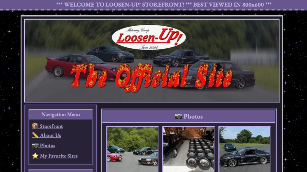
In an era defined by sterile, minimalist design systems, algorithmically optimized user interfaces, and the suffocating uniformity of social media templates, the Boston-based drift crew known as "Loosen UP!" has launched a digital rebellion. Their weapon of choice? A website that looks like it was exhumed from a 1997 time capsule, complete with all the charm—and technical quirks—of the pre-broadband era.
By launching s13.world, the team isn’t just selling merchandise; they are making a profound statement about the homogenization of the internet. While major brands spend millions on responsive design and mobile-first optimization, the Loosen UP! team has chosen to retreat into the past, proving that the chaotic, unrefined energy of the early World Wide Web remains the most effective way to capture attention in a saturated digital landscape.
The Main Facts: A Digital Time Machine
The Loosen UP! website is a masterclass in intentional obsolescence. Upon arrival, the user is greeted by a “Best Viewed in 800×600” banner—a relic of a bygone monitor resolution standard. The site utilizes a classic night-sky backdrop with twinkling CSS animations, a liberal use of high-contrast purple hues, and static, low-resolution imagery that feels remarkably authentic to the dial-up generation.
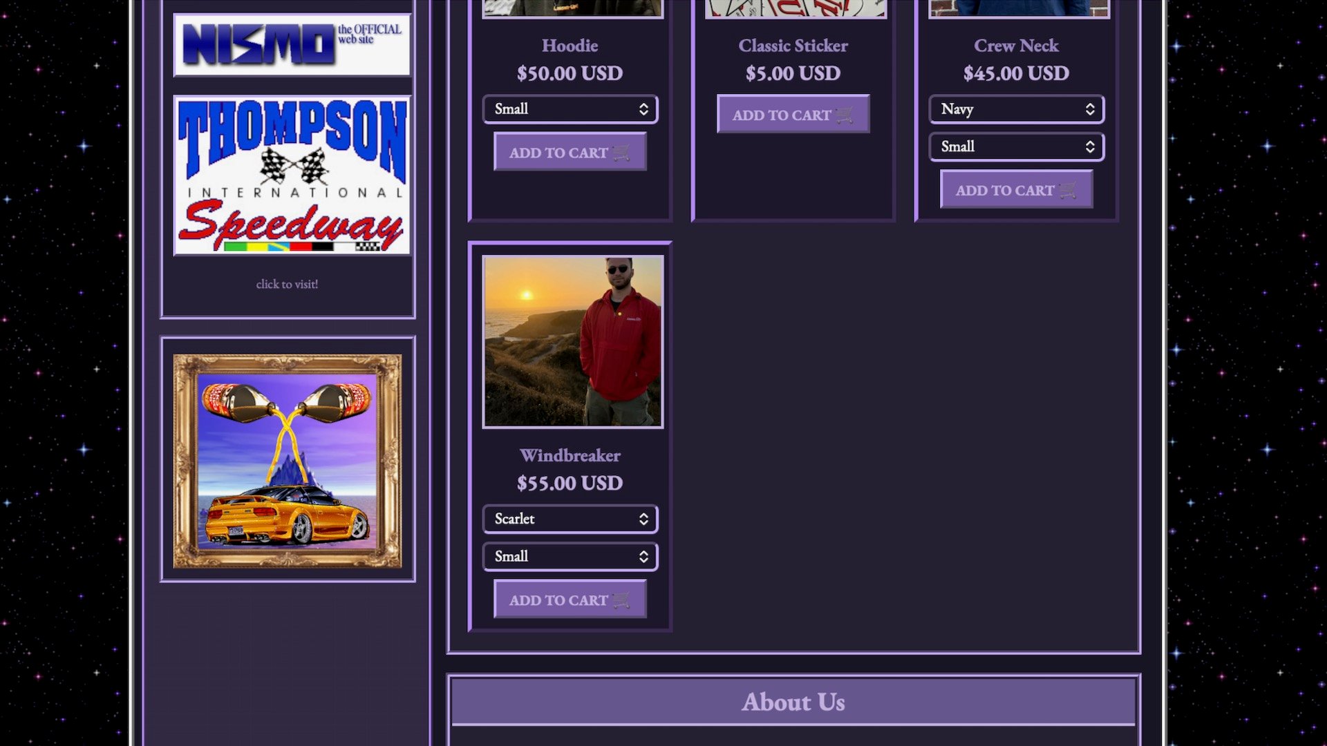
Unlike modern sites that push users through high-friction conversion funnels, s13.world prioritizes atmosphere. It features a manual visitor counter—a staple of Geocities-era web pages—and a "Favorite Sites" link section that feels like a curated blogroll from the dawn of the millennium. The core purpose of the site is to serve as a hub for the team’s drift culture content and merchandise, but the execution suggests a deeper interest in preservation than mere e-commerce.
The team, which includes The Drive’s own Aaron Segal, has effectively positioned their digital presence as an extension of their mechanical ethos. Just as they spend hours wrenching on analog, rear-wheel-drive drift machines, they have treated their website as a project car, rebuilding it from the ground up to reflect the aesthetic of the era when these specific vehicles were in their prime.
A Chronology of Style: From Netscape to Modernity
To understand why the Loosen UP! team’s aesthetic choice is so resonant, one must look at the evolution of the web.
- 1995–1999 (The Wild West): The internet was a blank slate. Personal websites were defined by HTML tables, blinking text, and a lack of professional design standards. This was the era of the "personal homepage."
- 2000–2010 (The Corporate Shift): As the internet became a commercial engine, "User Experience" (UX) became the governing law. Design became cleaner, safer, and ultimately more sterile.
- 2010–2020 (The Social Media Hegemony): Platforms like Instagram, Facebook, and TikTok stripped the individual’s ability to design their own space. Users became content creators within someone else’s walled garden, restricted to pre-set layouts.
- 2026 (The Retro-Revival): The Loosen UP! launch represents a modern pushback. By ignoring 25 years of "best practices," the team has reclaimed digital sovereignty, opting for a user experience that prioritizes personality over accessibility.
Supporting Data: Why "Bad" Design Works
The success of the s13.world experiment highlights a paradox in modern digital marketing: "friction" can be a competitive advantage. In a sea of frictionless, automated, and indistinguishable web pages, the intentional "clunkiness" of the Loosen UP! site acts as a pattern interrupt.
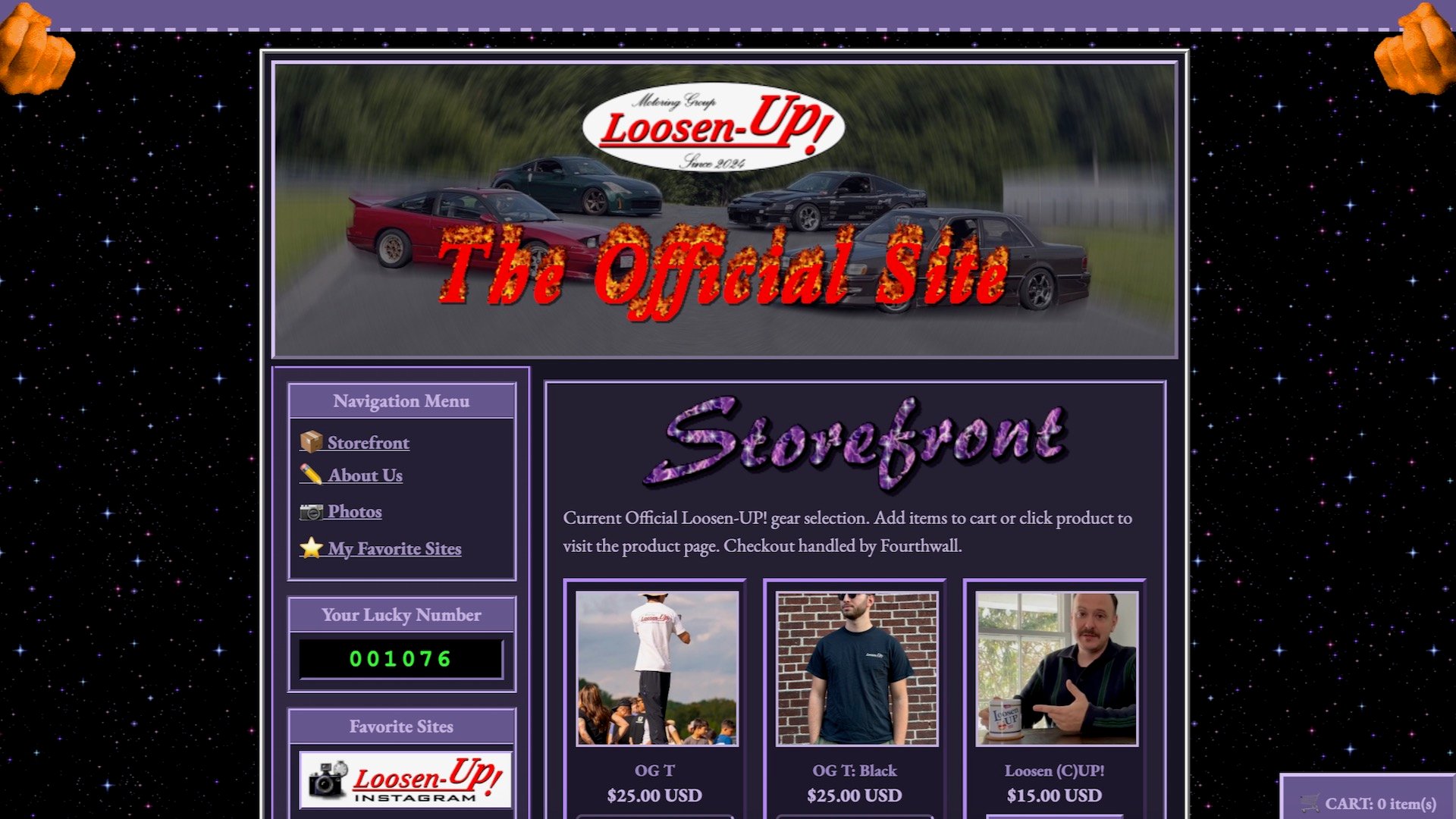
According to recent trends in web development, Gen Z and younger audiences—who never experienced the original 800×600 internet—are increasingly drawn to "Y2K aesthetics." This is not merely nostalgia, but a rejection of the "corporate aesthetic" that has dominated the web for the last decade.
- Engagement Metrics: While formal data for s13.world is private, similar "retro-themed" sites have seen higher "time-on-page" metrics compared to standard Shopify templates. Users are more likely to click through a manual menu and explore hidden easter eggs when the site feels like a curated experience rather than a digital catalog.
- Brand Identity: By aligning their brand with the early drift scene—an era defined by grassroots modification and "doing it yourself"—the team has created a cohesive identity. A modern, slick website would feel like a betrayal of their core values; the retro site feels like a testament to them.
The Drift Connection: Why the S13 Matters
The choice of URL—s13.world—is a direct nod to the Nissan S13 240SX, a foundational vehicle in the drifting world. The site features a gallery of the team’s stable, which includes the S13, the MX83 Toyota Cressida, and the Z33 Nissan 350Z.
These cars are the automotive equivalent of the website’s design. They are mechanical, tactile, and largely analog. They require a driver who understands the nuance of weight transfer and throttle control, just as the website requires a user who is willing to navigate a non-standard layout. There is an unspoken agreement between the creator and the visitor: "We are doing this for the love of the craft, not for the ease of the transaction."
Official Perspectives: The Philosophy of "Loosen UP!"
In interviews with members of the team, the consensus is clear: the modern internet has become a place where creativity goes to be standardized. By choosing to build a site that flies in the face of modern SEO and mobile-responsiveness, the team is reclaiming the joy of building something unique.
"We didn’t want a cookie-cutter shop," one team member noted during a private conversation. "We wanted a clubhouse. When you walk into a clubhouse, it doesn’t look like an office building. It’s messy, it has character, and it’s meant for people who belong there. That’s what s13.world is."
The team’s approach is a direct critique of the "algorithm-first" mindset. They aren’t trying to capture a massive, general audience; they are looking to foster a community of like-minded enthusiasts who appreciate the nuance of their specific subculture.
Implications for the Future of Web Design
The Loosen UP! project raises an important question for digital creators: Have we sacrificed too much of our individuality on the altar of optimization?
While it is unlikely that the world will revert to 800×600 resolutions for corporate commerce, there is a clear lesson here for independent creators, artists, and small teams. The "corporate web" is fine for buying groceries or booking flights, but it is a poor vehicle for self-expression.
1. The Death of the "Best Practice"
The Loosen UP! site proves that if your content is compelling enough, you can ignore the rules. Their use of low-contrast text and "cheesy" animations—features that would get a site penalized by Google’s accessibility standards—hasn’t stopped their target audience from engaging.
2. The Rise of the "Digital Clubhouse"
We may see a shift away from the "everything-app" model toward a new wave of boutique, intentionally difficult, and highly personalized websites. This "Anti-Design" movement is effectively the digital equivalent of a DIY punk zine; it’s not meant for the masses, and that is precisely what makes it valuable.
3. Nostalgia as a Business Strategy
The team has effectively used the cultural currency of the 90s to build a modern brand. By tapping into the aesthetic memory of their fans, they have created a sense of belonging that no amount of targeted advertising can replicate.
Conclusion: A Breath of Fresh Air
In the end, the Loosen UP! website is a refreshing reminder that the internet was once a place of wonder. It wasn’t always about conversions, clicks, and pixels-per-inch. It was about people building things that reflected who they were.
While the rest of the world rushes toward the next iteration of AI-generated, perfectly optimized, and entirely soulless web experiences, the Loosen UP! drift team is doing something much more radical: they are having fun. And in the modern digital age, that might be the most "disruptive" thing anyone can do.
If you find yourself weary of the endless stream of pop-up ads, cookie consent forms, and minimalist interfaces that all look identical, take a trip to s13.world. It’s a reminder that sometimes, the best way to move forward is to look back at the chaotic, unrefined, and beautiful origins of our digital world. Just make sure you’re viewing it at 800×600.
